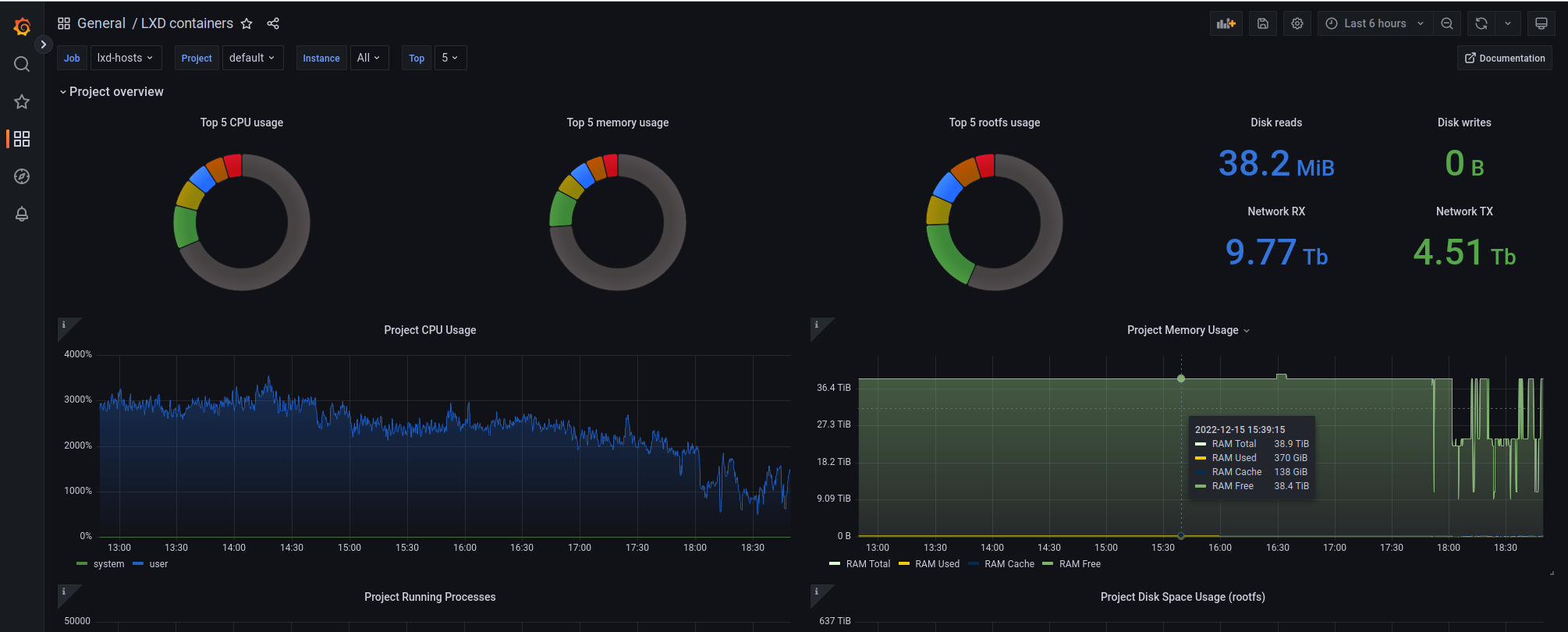
I’ve got a grafana dashboard up for monitoring 4 hosts with LXD.
My network is a “unmanaged” bridge.
One or a few containers are using up alot of bandwidth, but I can’t tell which ones.
Is there a dashboard that would display this information so that I can try to apply some rate limits on those, as they are now bogging down performance on my network?
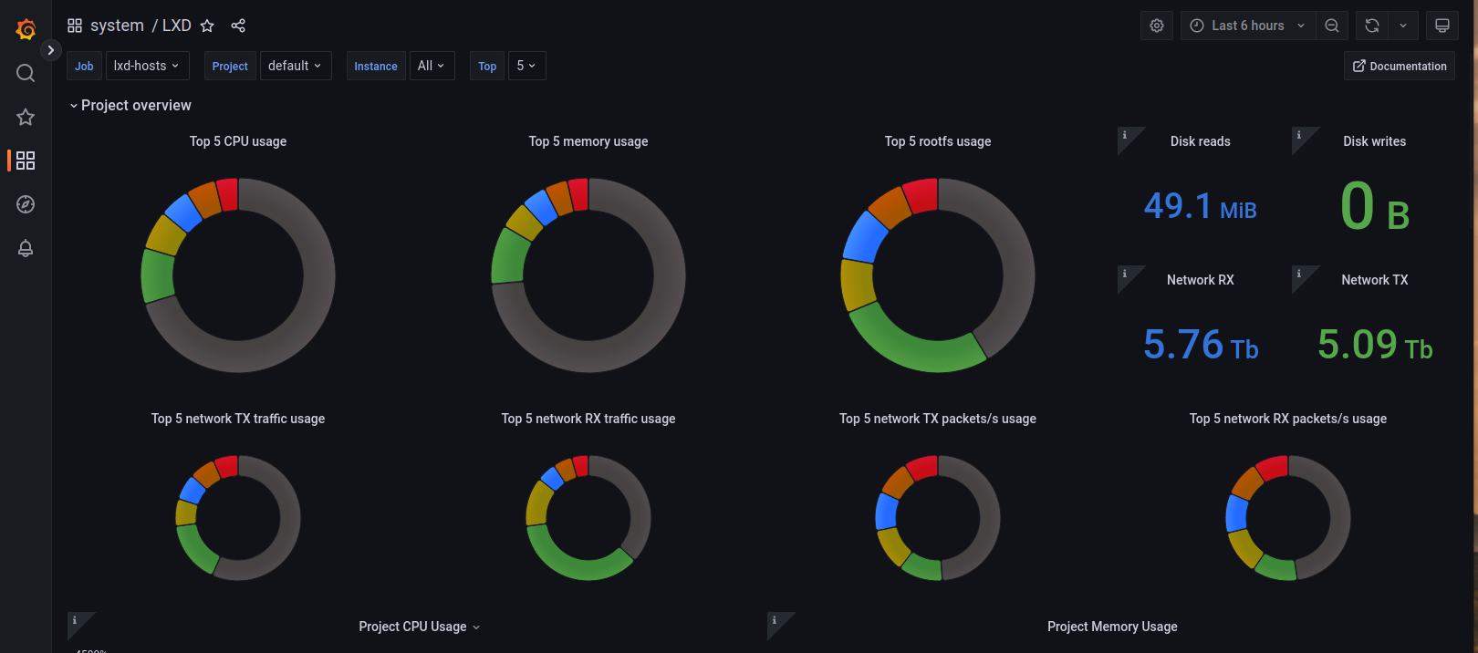
The current dashboard looks like this, but has no “top network users”
Must urgent, is that I would need some help to track down the most network-hungry containers.
Hi Erik,
It is not an elegant way but you can realize which container use much more bandwith with a simple bash script. for k in $(lxc list -f csv -c n); do echo "----- $k -----"; lxc info $k | grep -i eth0 -A 7 | grep -i Bytes -A 2;done
Regards.
Thanx alot, but I would need to graph this somehow over time, so a grafana-prometheus solution would be the only manageable situation…
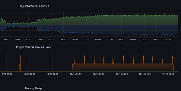
I also have the same situation for “packets” where I have a lot of TX drops atm which I would need to track down the containers which have this situation.
The current LXD dashboard has been helpful so far, but not all the way. Below you can see the packet issue @sdeziel
The top project overview panel become a little crammed but I’m happy to add more graphs. ATM, we show top CPU, RAM and rootfs usage for a project. Adding pie charts for network and disk bandwidth would make sense.
Those each have 2 metrics (TX/RX and read/write) and I was wondering if they should be added to get the combined traffic (in bps) or go with a pie chart for TX and another for RX. I’m leaning toward the combined chart but I’m open to suggestions.
Absolutely. The dashboard would be great to be able to group-by-lxd-host or a means to narrow scope of visualization to host-level issues. For example when storage, cpu or network activities grow in a single host etc. When running thousands or hundreds of containers across multiple hosts, this becomes challenging and using the dashboard to make the analysis is really good.
I’m not sure, but also network errors/drops would be good as this is an early indication of major and sometimes intermittent issues which is hard to track down.
I understand your point regarding multiple LXD hosts but I think the LXD dashboard overview should remain a per-project view. The rational being that those running a monitoring stack would typically have other things providing per-host details (i.e: node exporter).
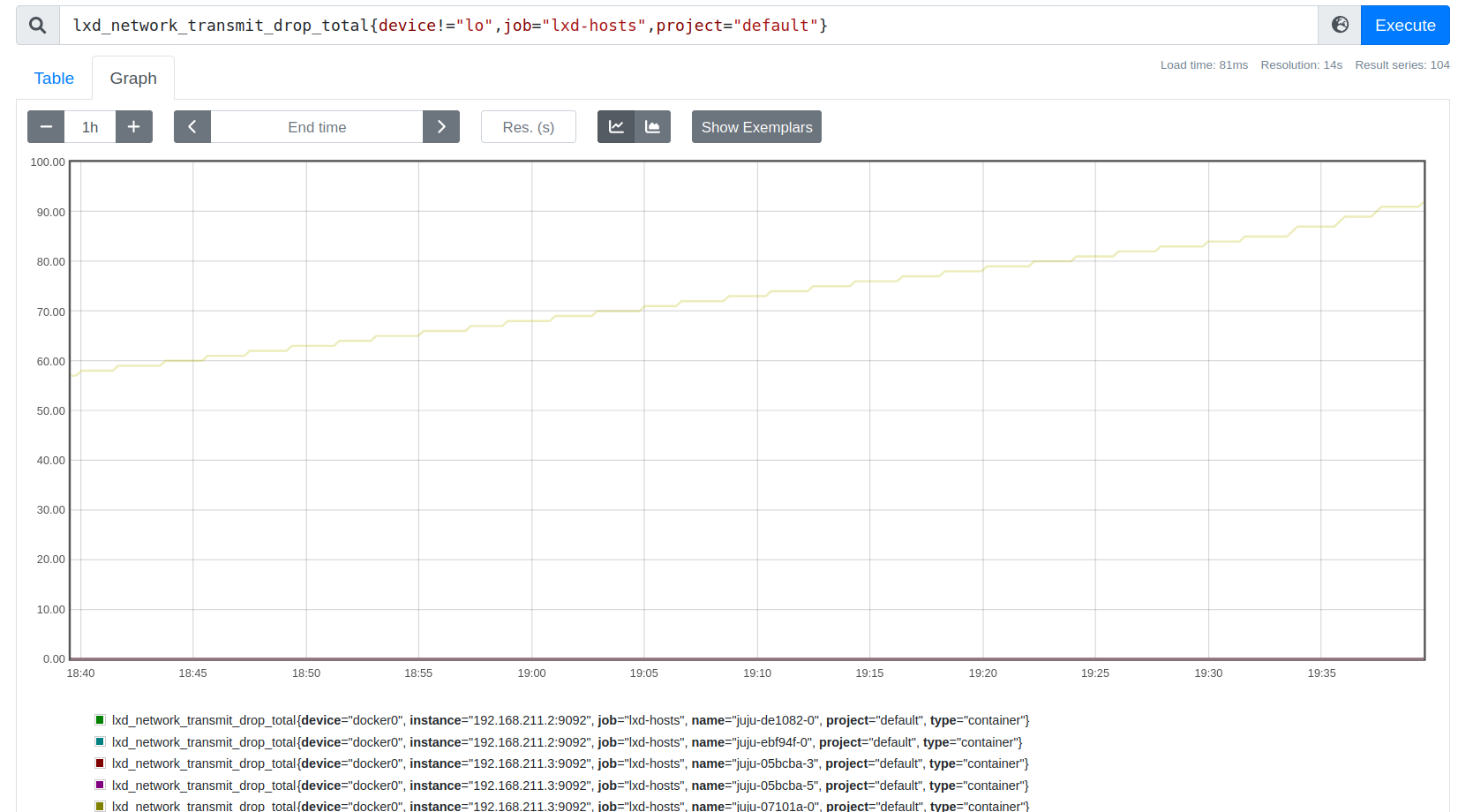
For network errors/drops, I think the per-project graph should be enough to identify if there are any such error condition in which case, the operator would be expected to go to the Prometheus host and run some queries to identify the precise source.
When we get back from vacation, I’ll chat with Stéphane about the TX/RX and read/write graphs as those feel like good additions, thanks for suggesting!
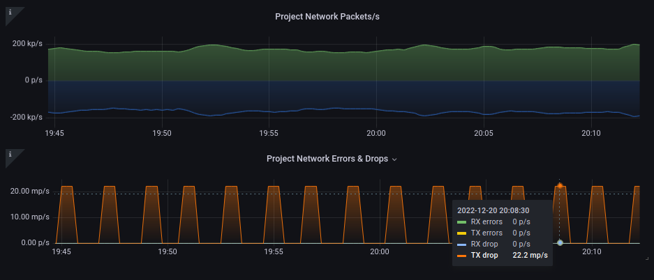
We have a single project “default” and as you can see, we seem to have some packet drops… somewhere.
We suspect this is affecting our haproxy which periodically (every 2 minutes) introduces high latency. I’ve been chasing this issue for days without success.
After discussing with Stéphane, we concluded that adding the project overview graphs for disk wouldn’t be that useful because few storage backends expose those metrics.
Block/IO schedulers are being dropped to reclaim performance. The drawback is that we lose visibility along the way. We’ll evaluate if we keep the other broken disk metrics in the long run or not.
Your simple bash worked fine. Thanks for sharing.
Though it lists instances in the actual project only.
As project list is not offering options for output format and fields selection, makes it a little trickier, but this will do:
for i in $(lxc project ls | grep -v NAME | grep -v + | cut -d " " -f 2); do
for k in $(lxc list -f csv -c n --project ${i}); do
echo "---$i-- $k -----"; lxc info $k --project $i| grep -i eth0 -A 7 | grep -i Bytes -A 2;
done
done